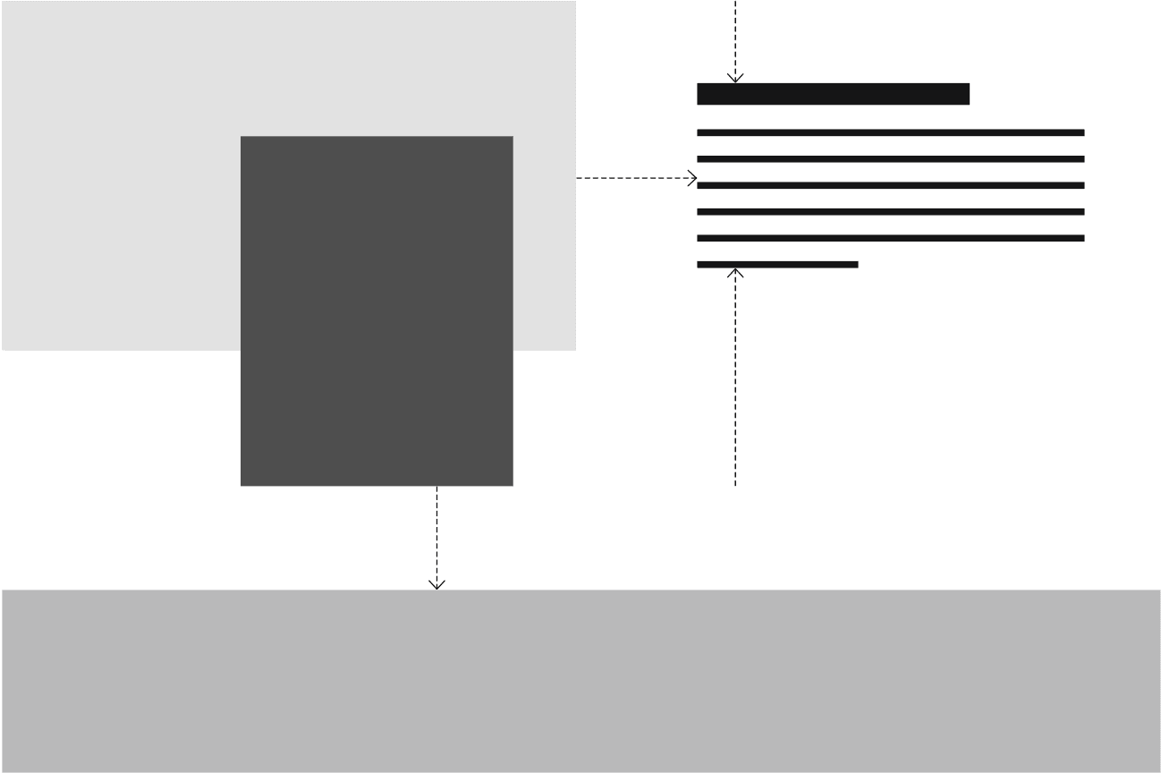
We've tried to make a very broad approach to designing with few rules. Tjek is defined by what we do and say, and the content we create should support this.
Keep in mind that we have designed an organization that builds services that make people's daily lives better. Our general theme is coming up with solutions for recurring problems, challenges and issues in people’s daily lives.
We design for the ordinary person using our apps on an ordinary day, which means that we aim to be very down to earth and human. And this approach also goes into how we write and communicate more generally, incorporating content (pictures, videos, etc.) to create the right feel and experience for the audience in question.
Logo
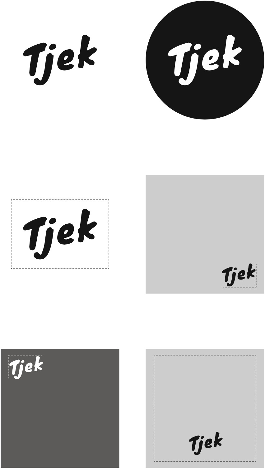
The Tjek logo tries to capture the feeling of being on top in your daily life, which is why it's tilting upwards. The logo also looks hand drawn to symbolize that Tjek is human, meaning we are a group of people building for other people. We treat people as humans and avoid being too robotic.
You can use the logo in either black or white depending on the context but try to use the black logo with white background whenever possible.
As a rule of thumb, the smaller the logo the better.
Our logo is not our brand alone, and the logo has nothing to do with how well people remember our brand.
You can find our brand assets here.
Colors, typography, and graphics
Tjek is the overarching brand for a series of products and brands such as our shopping apps, Incito, etc.
Tjek's visuals are defined by:
· Black (#1d1d1b) and white (#ffffff)
· Simplicity
· Lots of whitespace
Tjek uses the font Rubik in two versions: regular and bold. The text should be used with a rather high line height as well as lots of margin and padding.
Graphical elements should be kept in black/white or greys and pictures in color, again, with lots of whitespace. The layout is up to interpretation, and it is okay to follow the latest trends.

Why black/white?
Besides the risk of growing tired of a color after a year, the main reason for keeping Tjek black/white is because we want to keep a neat focus on content. Too many brands just fill out their website(s) with lots of brand illustrations instead of focusing on delivering real value. A brand should support its content and not be the content.
This page doesn't use much color, as it's meant as a guide. See the different pages on this website for examples of how content can create emotion.
When we make a presentation, a screen, or something else, it is the content that defines it. This forces you to reflect on what you show with your presentation. You will not be helped by a huge illustrations folder. Content is indeed key when working with the Tjek brand, which is why we have opted for a brand design that is not too rigid or set in stone so that our employees can develop content more freely. We don't want to have designers (or anyone for that matter) determining a one-way approach to content creation.
Sub-brands
What then happens to the design when working in a non-Tjek context such as in our shopping apps? Well, it depends... If what you're building is something people are going to use recurringly, we try to follow these principles:
· Tight focus on UI and UX—Design is how it works.
· Inherit the Tjek brand (e.g., down to earth and human)
· Don't be marketing-y (content > idle chit-chat)
· Provide value
· Be on point with your message
· Prioritize whitespace, simplicity, and few colors
· Be a great citizen on the visitors’ devices
o Inherit font family
o Respect light/dark mode
o Focus on accessibility
o Be responsive and accessible
If you're designing something like a landing page that people will only see once, you have more creative freedom.
